Responsive websites are more than just a web development buzzword – they are a must these days. As consumers shift from desktop to tablet to mobile, the website must respond to the needs of those different devices in order to be effective. Web developers know this…and so does Google. But what exactly is a responsive website?

Adaptive web design (AWD) / Responsive Server Side (RESS) is a responsive web-design with that uses server-side components. The first part (AWD) means that the site adapts and changes according to your device. The second part (RESS) means that the device detection is done on the server side. The server (that’s where your site is hosted) does all the work – such as detecting the device and its attributes, finding the correct version that aligns with that device and features, and then serving that up for the user. Server side components are used to deliver the HTML and styling of the site that is designed for a particular device based on the user-agent it detects. User agent is a software agent that tells the server whether the request from the end user to view your website is from a desktop, tablet or mobile.
So what are the benefits of responsive sites and server side device detection? Responsive sites allow a user to move with ease through your information regardless of what type of device they are on. From a usability and technical standpoint, the needs of a visitor vary depending on the device. That means that the site must function according to the device, and responsive sites provide that experience. Not to mention that responsive sites are Google’s recommendation and we should continue to adhere to their guidelines.
Server side device detection as a means to developing your responsive site will only help to boost its effectiveness. The value of RESS is the speed in which the site is served. Think about it – if you have multiple versions of the same site to sift through, you don’t want to have to rely on a user’s internet connection speed or software to do the work for you. Keeping this technology with the server improves the speed and increases browser compatibility. This helps improve usability and overall conversion of your site.
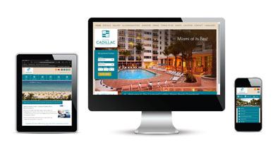
With the AWD approach, the layout for a specific device type will be loaded on fly. Try testing it out by visiting one of our sites – The Courtyard Cadillac Miami Beach Oceanfront – from a few different devices such as an iPad, Samsung Galaxy S5 or Kindle, if you have them handy. We design different layouts for our sites for a minimum of three types of devices (desktop, tablet and mobile).
This approach allows us to optimize the mobile and tablet experience by taking advantage of the features that these devices offer like accessing geo-location and using touch gestures. Using a server-side approach to build responsive sites cuts down the website load time enormously by serving the best version of a site, further enhancing their experience.
Contact us at +1 408-200-2211 or email us at sales@milestoneinternet.com.
Sources:
http://www.smashingmagazine.com/2012/09/24/server-side-device-detection-history-benefits-how-to/
http://www.huffingtonpost.com/garrett-goodman/adaptive-design_b_2344569.html
http://marketingland.com/is-adaptive-web-design-or-ress-better-than-responsive-web-design-for-seo-59389
________________________________
Contributed by:
Preethika Kalyanasundaram, Product Specialist
Cassie Vignieri, Sr. eStrategist / Account Manager

